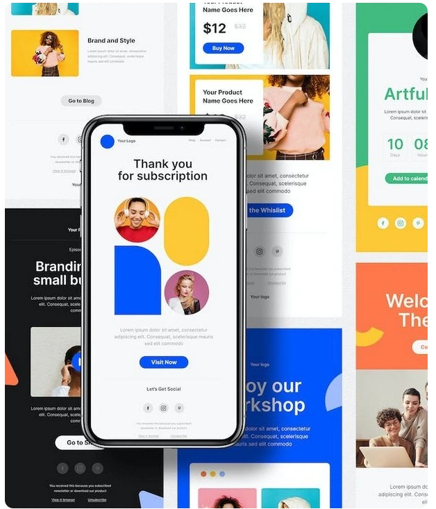
Email template design is more than just aesthetics; it’s a critical part of building trust, improving user experience, and ensuring your brand stands out in a crowded inbox. A polished email design builds trust, strengthens brand recognition, and encourages more conversions.
Whether you are a SaaS company, a fast-growing startup, or an established business, learning how to design email templates that reflect brand style can make the difference between emails that get ignored and those that engage subscribers.
In this blog, we’ll walk through 7 proven strategies for mastering email template design while aligning it with your overall email marketing strategy.
1. Fonts – More Than Just Letters in Email Template Design
Fonts define personality. In email template design, typography sets the tone of your brand. A modern SaaS brand may prefer streamlined sans-serif fonts, while professional services like law firms usually adopt traditional serif styles.
Best Practice: Always use web-safe fonts like Arial, Verdana, or Georgia for compatibility. When using custom fonts in email template design, always include reliable fallback options.
Consistent font usage (sizes, hierarchy, and weight) improves readability and builds brand recognition, an essential part of any brand style guide for email templates in SaaS marketing.
Tip: Use bold fonts for headers, medium weights for subheadings, and regular weight for body text.
2. Color Palette – A Powerful Tool for Visual Branding
In design, colors act as powerful psychological triggers, not just visuals. A brand style guide for email templates should include consistent use of colors across campaigns.
- Blue: trust & reliability (popular in SaaS).
- Red: urgency & excitement.
- Green: freshness & growth.
Best Practice: Use primary brand colors for headers and CTAs, secondary shades for section backgrounds, and accent tones sparingly. Always check contrast ratios for accessibility
Tip: Highlight CTAs with accent colors to boost click-through rates.
3. Button Stylings – Driving Clicks with Design
Buttons are conversion tools, not decorations. Ensure the shape, size, and positioning reflect your overall brand style.
Best Practice: Use large, high-contrast buttons with strong action words like “Start Free Trial” or “Download Now.” Maintain consistent button designs across campaigns for familiarity.
Tip: Rounded corners often feel friendly, while sharp edges convey authority. Choose based on your branding tone.
4. Background Colors – Setting the Tone
The background color in email template design sets the mood and improves readability.
- White or light tones → minimal & clean.
- Soft neutrals → sophistication.
- Bold colors → modern & striking.
Best Practice: Test background colors across devices and email clients to ensure visibility and mobile responsiveness.
Tip: Separate key sections in your email design with subtle background shades, making content easier to navigate.
5. Borders – Small Details with Big Impact
Borders may seem minor, but they help organize content blocks and guide user flow.
Best Practice: Opt for subtle border lines that guide the reader without creating visual clutter. Gradient or dashed lines can be used sparingly if it matches your SaaS branding.
Tip: Use borders to frame promotions or highlight CTAs without adding clutter.
6. Spacing In-Between Elements – The Silent Hero
Good spacing is the difference between professional email template design and chaotic layouts. Padding and margins give your content “breathing room” and make emails easy to read.
Best Practice: Use consistent spacing across campaigns. On mobile, ensure touch-friendly gaps between clickable elements.
Tip: Adopt a grid system for alignment; it keeps everything structured and visually appealing.
7. Create an Email Template Design Guide for SaaS Branding
To ensure long-term consistency, businesses, especially SaaS companies, should create an email template design guide for SaaS branding. This guide ensures:
- Fonts, colors, and button styles remain uniform.
- Emails across departments follow a single brand identity.
- Faster campaign creation with pre-approved templates.
Tip: Store your email design guidelines alongside your brand style guide for easy access.
Final Thoughts
A powerful email template design is not just about aesthetics; it’s about creating a branded experience that converts. From fonts and colors to spacing and buttons, every design element should align with your identity.
Remember, consistency builds trust. By applying these strategies and building a brand style guide for email templates in SaaS marketing, you’ll boost recognition, engagement, and conversions.
If you’re ready to take your email template design to the next level, start small, test, iterate, and refine. Above all, remember that consistent branding can be a game-changer for driving conversions.
Disclaimer: This blog post was created with the assistance of Human Content Creators, AI and Search tools to help collect information, plan content, and ensure accuracy. We strive to deliver valuable and well-researched insights to our readers.

Joemon - Senior Graphic Designer
Joe is a seasoned email design specialist with over 16 years of experience crafting high-impact email creatives across industries. As the Senior Graphic Designer at cmercury, he has been instrumental in designing 1000+ world-class templates that power some of the platform’s most successful campaigns. Joe blends design precision with email marketing strategy, helping brands communicate with clarity, creativity, and measurable results.