In today’s crowded inbox, using the best colors for email marketing can be the difference between your email getting opened or ignored. While subject lines and copy matter, colors play a crucial role in grabbing attention, guiding the reader’s eye, and inspiring action. The right email marketing color strategy not only reflects your brand but also influences how your audience feels and reacts.
Let’s explore the psychology of colors in email marketing, how color choices impact engagement, and the best strategies to pick the best colors for email marketing campaigns.
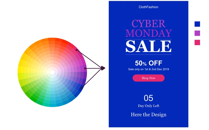
The Psychology Behind the Best Colors for Email Marketing
Colors are more than just decoration; they are powerful psychological triggers. The psychology of colors in email marketing shows how different shades evoke unique emotions:
- Red – Creates urgency and sparks action (great for flash sales).
- Blue – Builds trust and signals professionalism.
- Green – Represents growth, freshness, and balance.
- Yellow – Grabs attention but can feel overwhelming if overused.
- Black – Conveys luxury and exclusivity.
Marketers can strategically use these psychological cues to drive engagement. For instance, HubSpot research shows that CTA buttons in contrasting colors often outperform those that blend in.
How Email Color Choices Impact Engagement
Your color choices directly affect readability, click-through rates, and conversions. A brightly colored CTA button in contrast to the email background, can instantly guide attention and encourage action, whether it’s registering for a webinar, downloading a guide, or making a purchase.
Think of your emails as a visual journey:
- Headings in bold, consistent colors establish hierarchy.
- Buttons in warm, contrasting colors encourage clicks.
- Subtle, light tones reduce distractions and focus attention on your content.
Simply put, color can make or break your campaign’s engagement rate.
Aligning Colors with Your Brand Identity
When selecting the best email marketing color strategies, brand consistency should come first. Subscribers should recognize your emails instantly by your color palette. Aligning your email design with your brand’s identity builds trust and familiarity across channels, website, social media, and inbox.
If your brand color is blue, using orange as a CTA button provides contrast while still complementing your identity. This balance reinforces recognition and action.
Readability & Accessibility in Email Design
Email design should not only look good but also remain accessible to all users. For inclusivity:
- Ensure strong contrast between text and background.
- Avoid light text on light backgrounds.
- Test how emails appear in dark mode, now a default setting for many users.
Accessibility improves engagement because if readers can’t comfortably see your content, they won’t interact with it. Following W3C accessibility guidelines helps ensure inclusivity in your campaigns while using the best colors for email marketing effectively.
Best Practices for Using Colors in Email Marketing
To maximize the impact of your color strategy, follow these proven steps:
- Stick to 2–3 main colors from your palette.
- Use contrasting colors for CTAs to guide clicks.
- A/B test color choices to find what resonates with your audience.
- Apply colors with purpose, don’t just decorate; direct attention.
Avoid Overusing Colors
Adding too many colors may seem eye-catching, but it often distracts from your main message. Excessive use of colors or visuals makes emails look cluttered and less impactful. Instead, stick to neutral backgrounds with bold accents, ensuring your CTAs remain the hero element.
Winning Color Combinations for Marketing Emails
If you’re unsure which shades to pair, try these proven color combinations for email marketing:
- Blue + Orange → Trust with a call to action.
- Black + Gold → Luxury and exclusivity.
- Green + White → Freshness and simplicity.
- Red + Gray → Energy with professionalism.
The best combinations depend on your target audience, what appeals to Gen Z may not resonate with corporate executives.
Final Thoughts: Why Color Strategy Matters
The impact of colors in email marketing is undeniable. From reinforcing your brand identity to boosting click-through rates, colors influence how your subscribers perceive and engage with your messages.
By understanding the psychology of colors in email marketing, testing combinations, and prioritizing accessibility, you’ll discover the best colors for email marketing that work for your unique audience.
Color isn’t just aesthetic; it plays a vital role in boosting response rates. Choose wisely, because the shades you use could be the reason a subscriber clicks “buy” or closes your email.

Disclaimer: This blog post was created with the assistance of Human Content Creators, AI and Search tools to help collect information, plan content, and ensure accuracy. We strive to deliver valuable and well-researched insights to our readers.

Joemon - Senior Graphic Designer
Joe is a seasoned email design specialist with over 16 years of experience crafting high-impact email creatives across industries. As the Senior Graphic Designer at cmercury, he has been instrumental in designing 1000+ world-class templates that power some of the platform’s most successful campaigns. Joe blends design precision with email marketing strategy, helping brands communicate with clarity, creativity, and measurable results.